Zentaii
Packaging system and product photography for a skincare range
- Services
- Brand Design · Packaging · Art Direction · Product Photography
- Client
- Zentaii

A shelf that sorts itself.
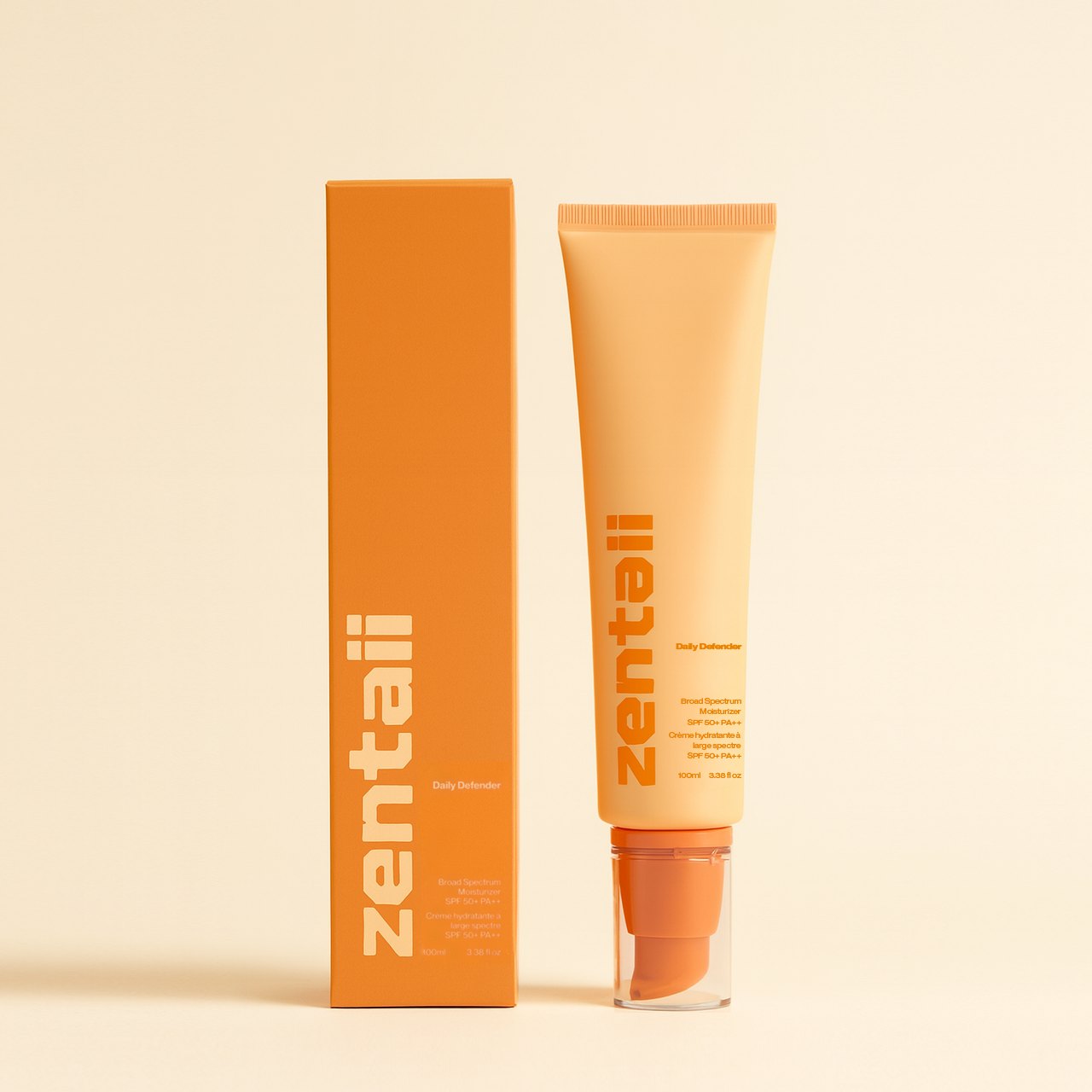
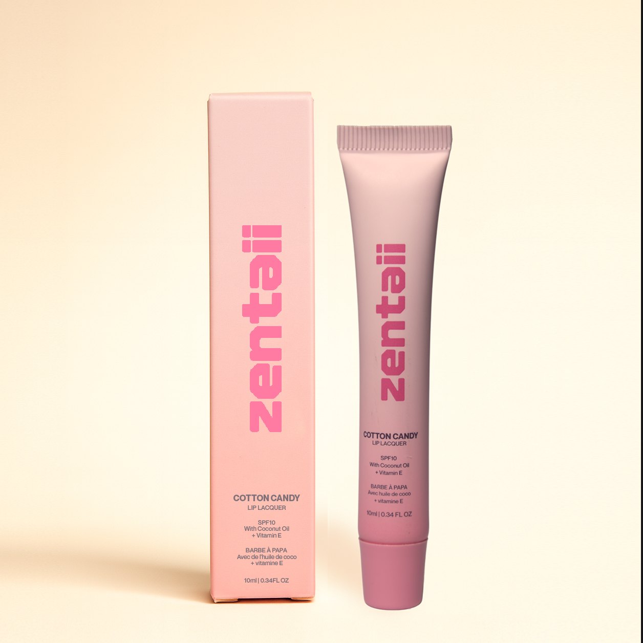
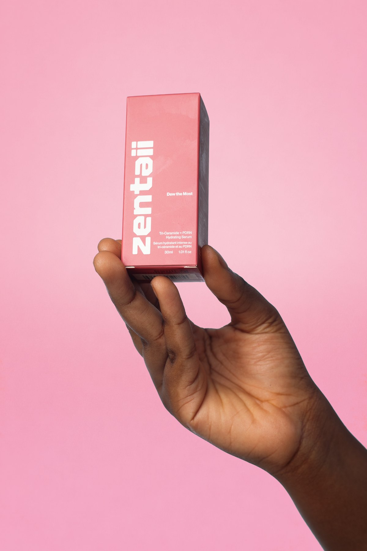
Zentaii is a skincare and colour range built around a single geometric wordmark set vertically up the pack. With the type fixed, colour is left to do all of the navigation — a customer finds the toner or the SPF by hue before reading a word.
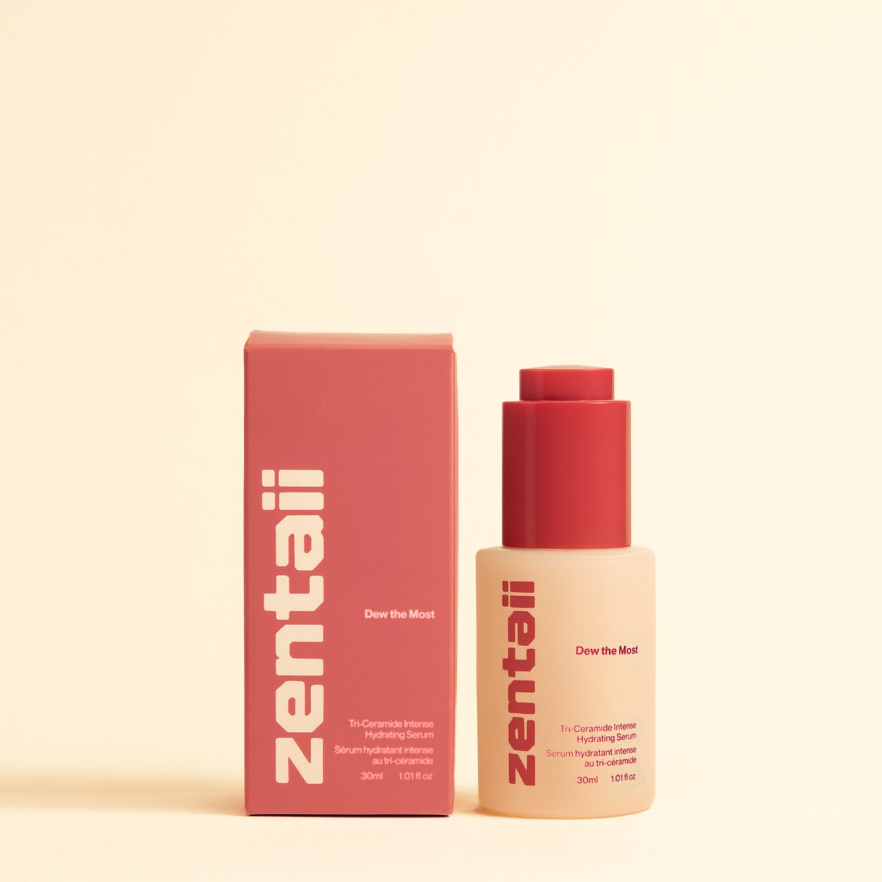
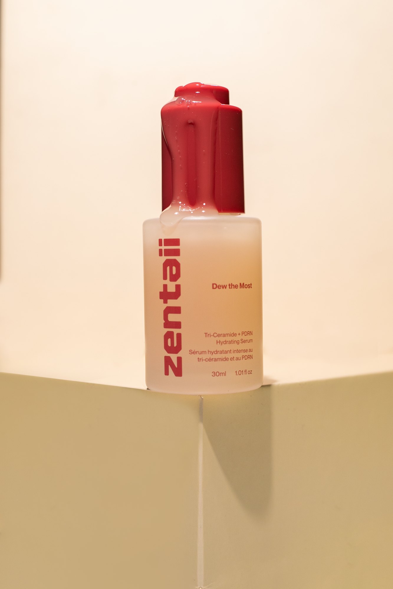
The system had to hold across three formats at once: a slim carton, a frosted glass bottle and a soft tube. Each takes the same lockup at a different scale without redrawing anything.
- Client
- Zentaii
- Discipline
- Design · Visual
- Scope
- Packaging, art direction, photography
- Year
- 2026
The system
Colour is the index.
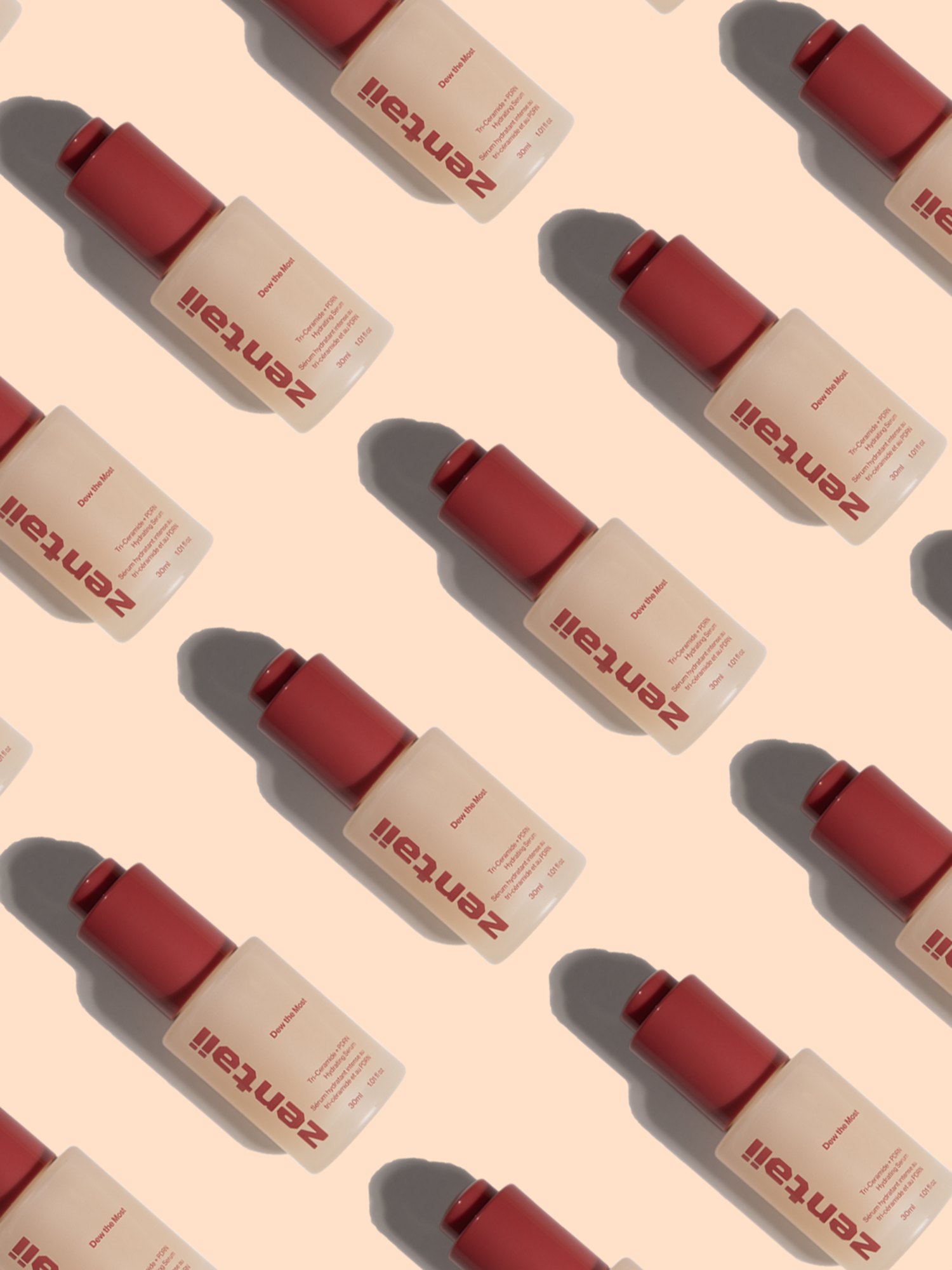
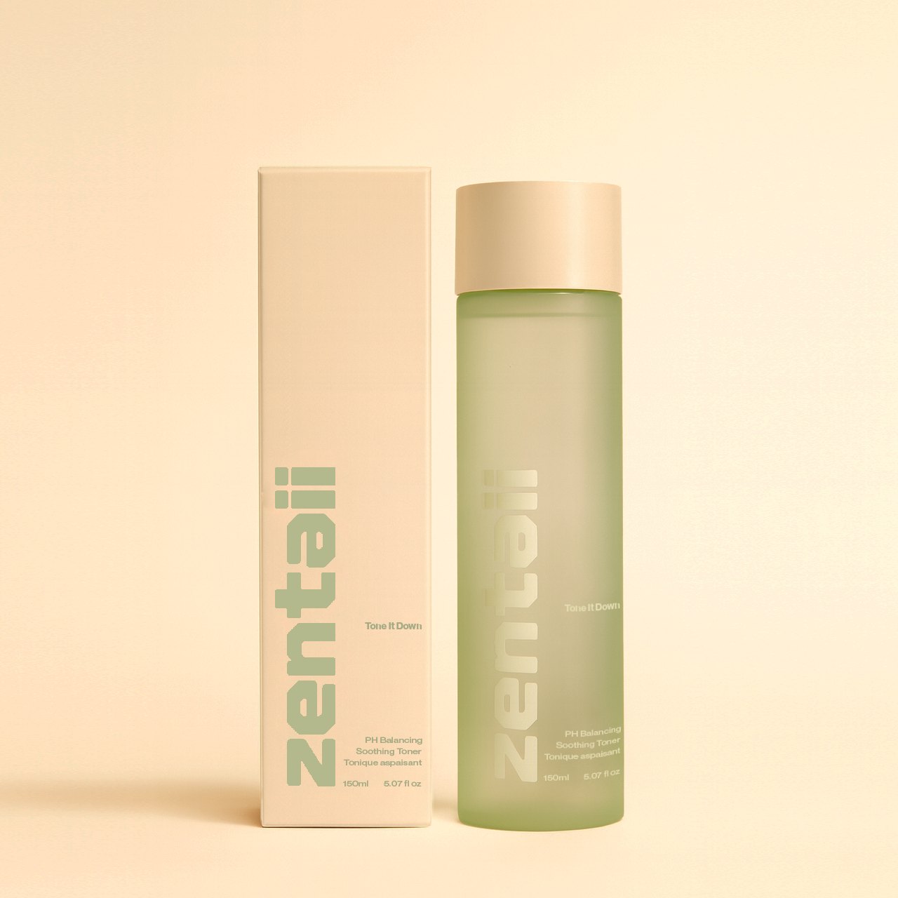
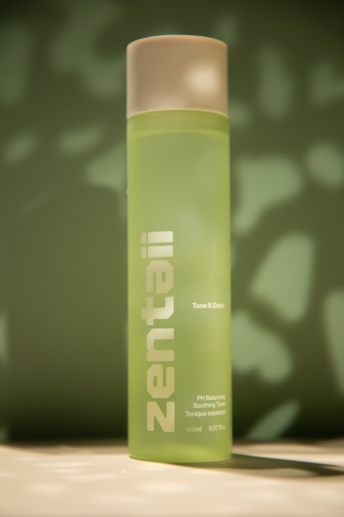
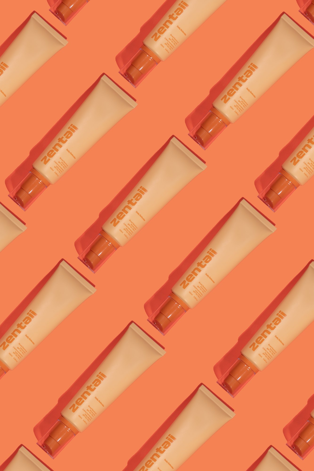
Each product owns a hue and keeps it across carton, bottle and cap — deep red for the serum, olive for the toner, orange for the SPF, pink for the lip range. The wordmark never changes weight or position, so the range reads as one family from across a room.
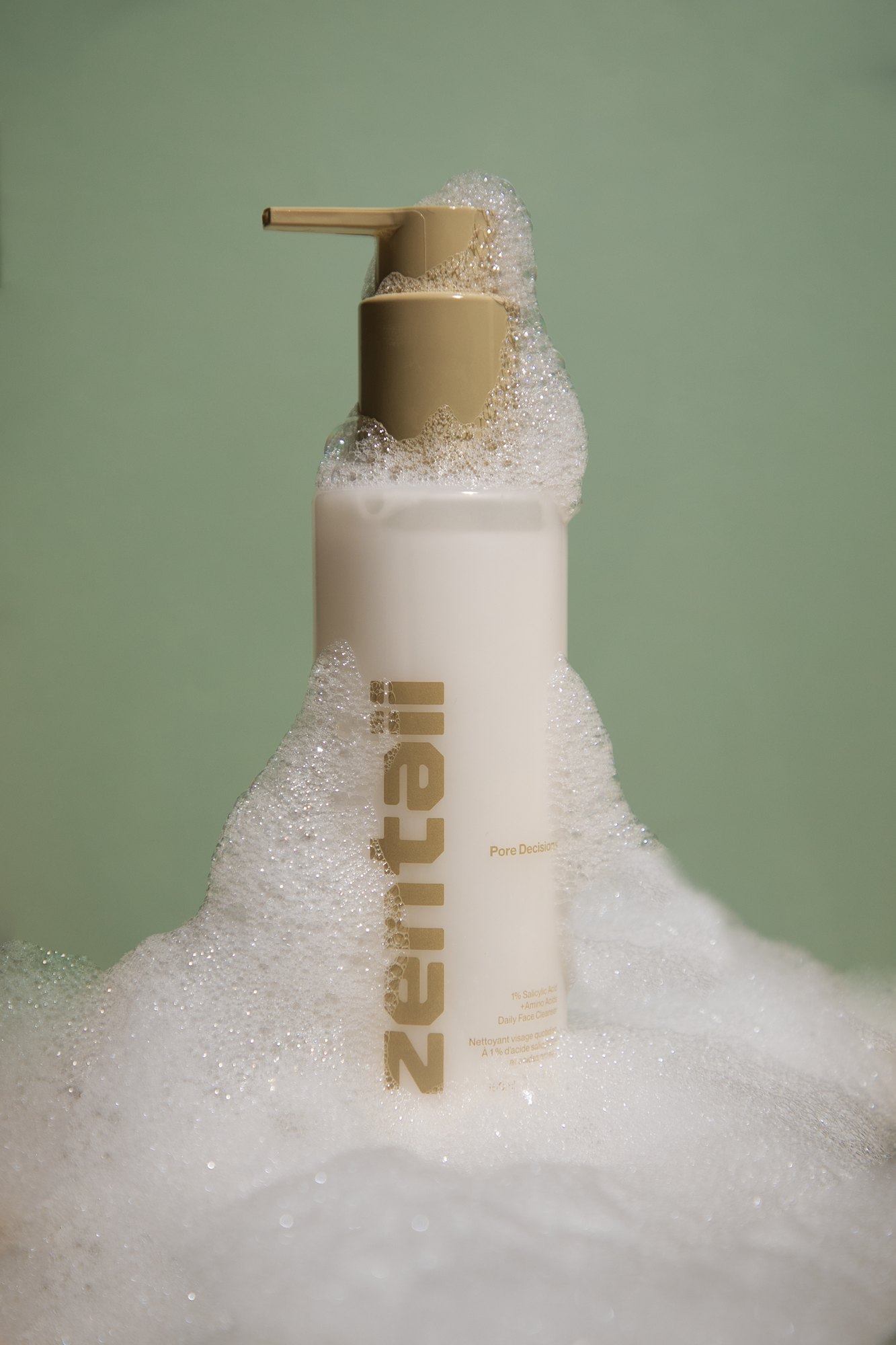
Names carry the tone the packaging refuses to — Pore Decision, Tone It Down, Dew the Most, Daily Defender — so the design can stay flat and let the wit sit in the copy. Every pack is labelled in English and French, which fixes the hierarchy before layout begins rather than after.
Art direction
Hard light, and a shadow that means it.
The imagery is lit with a single hard source so every product throws a long, defined shadow. It keeps the frosted glass and matte tubes reading as objects with weight instead of renders.
Backgrounds are drawn from the pack itself, so the product sits inside its own colour rather than on top of a borrowed one. Nothing in the frame is there that the product did not bring.
Texture
Show the product, not the promise.
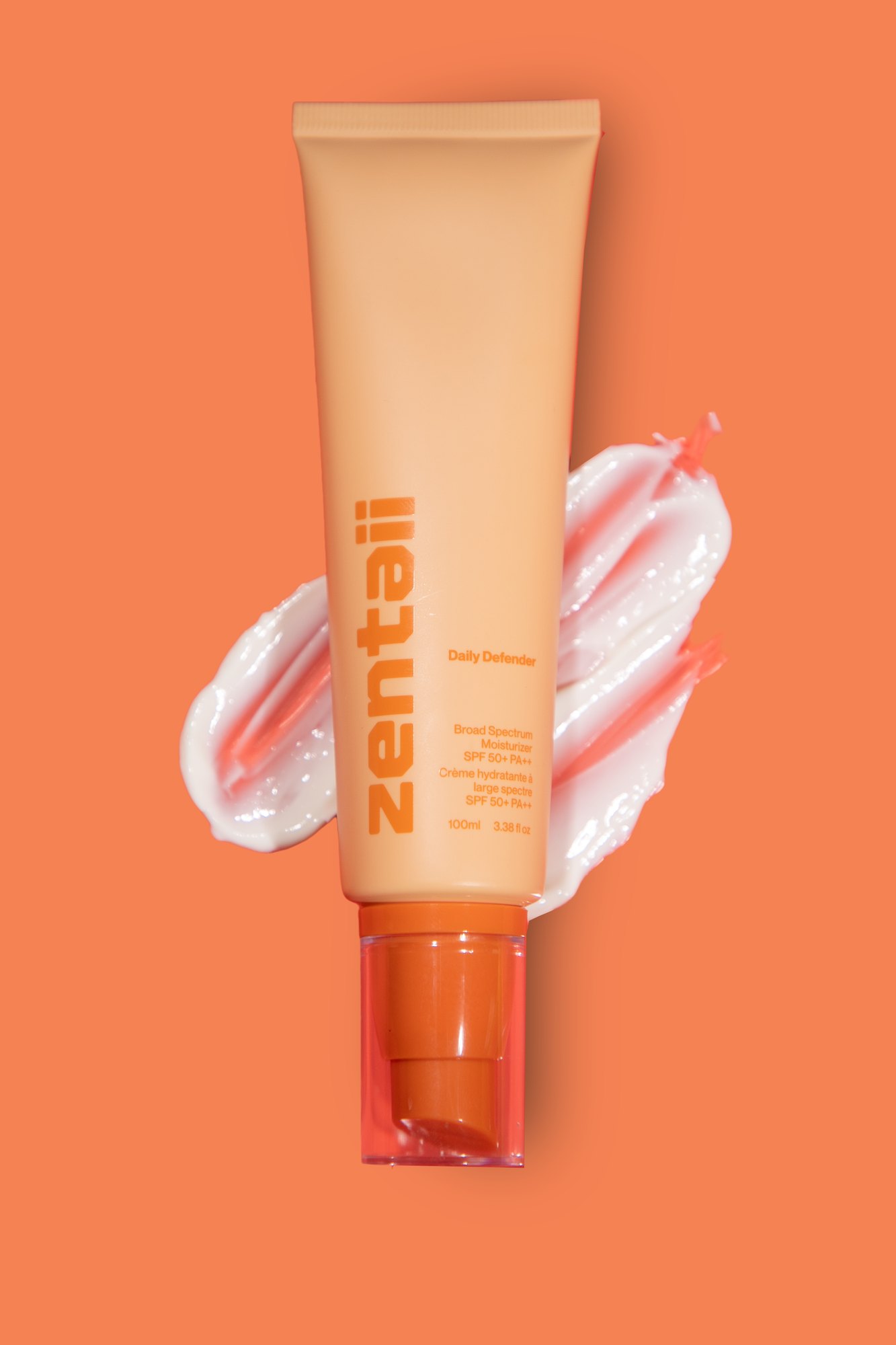
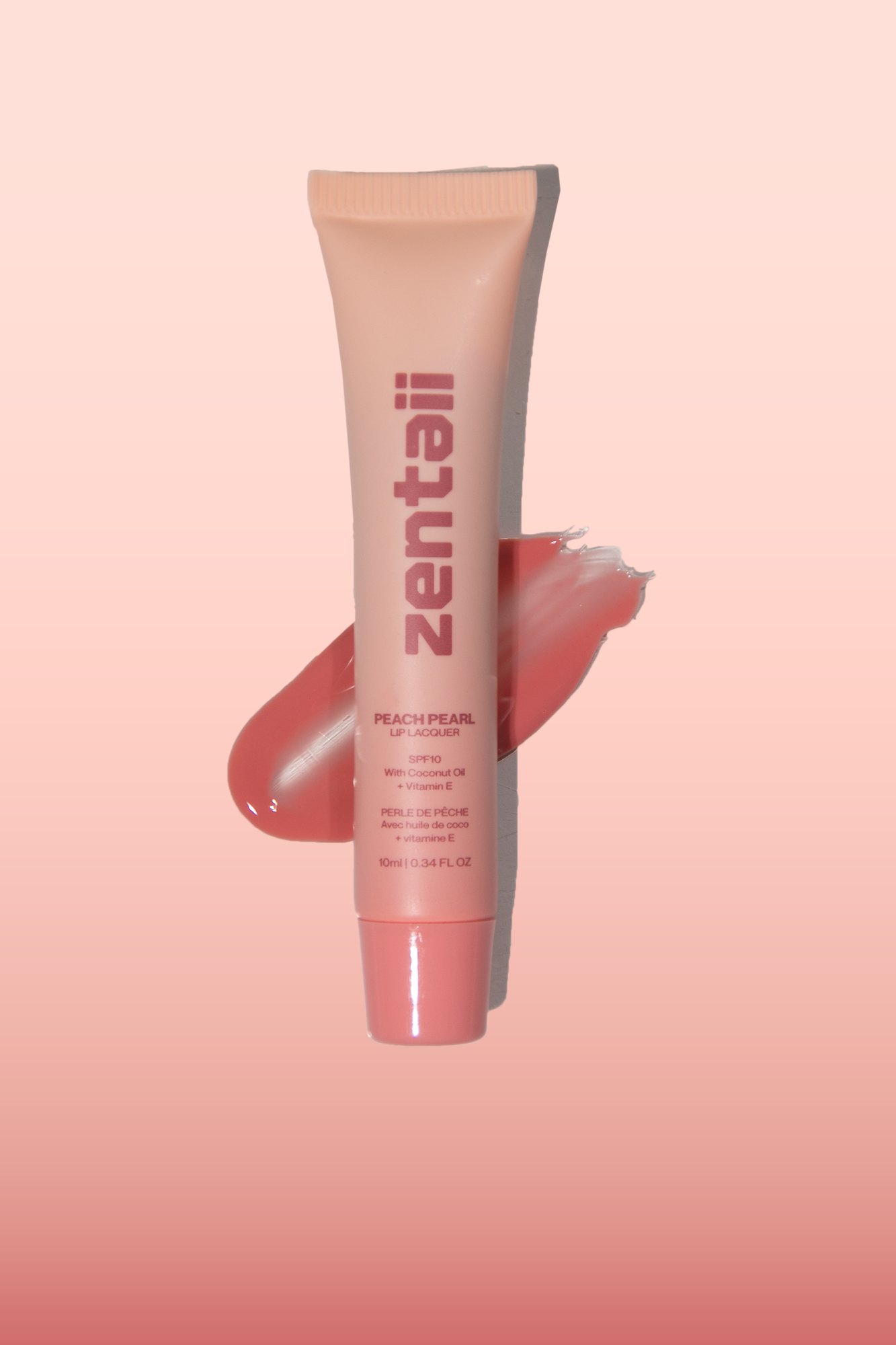
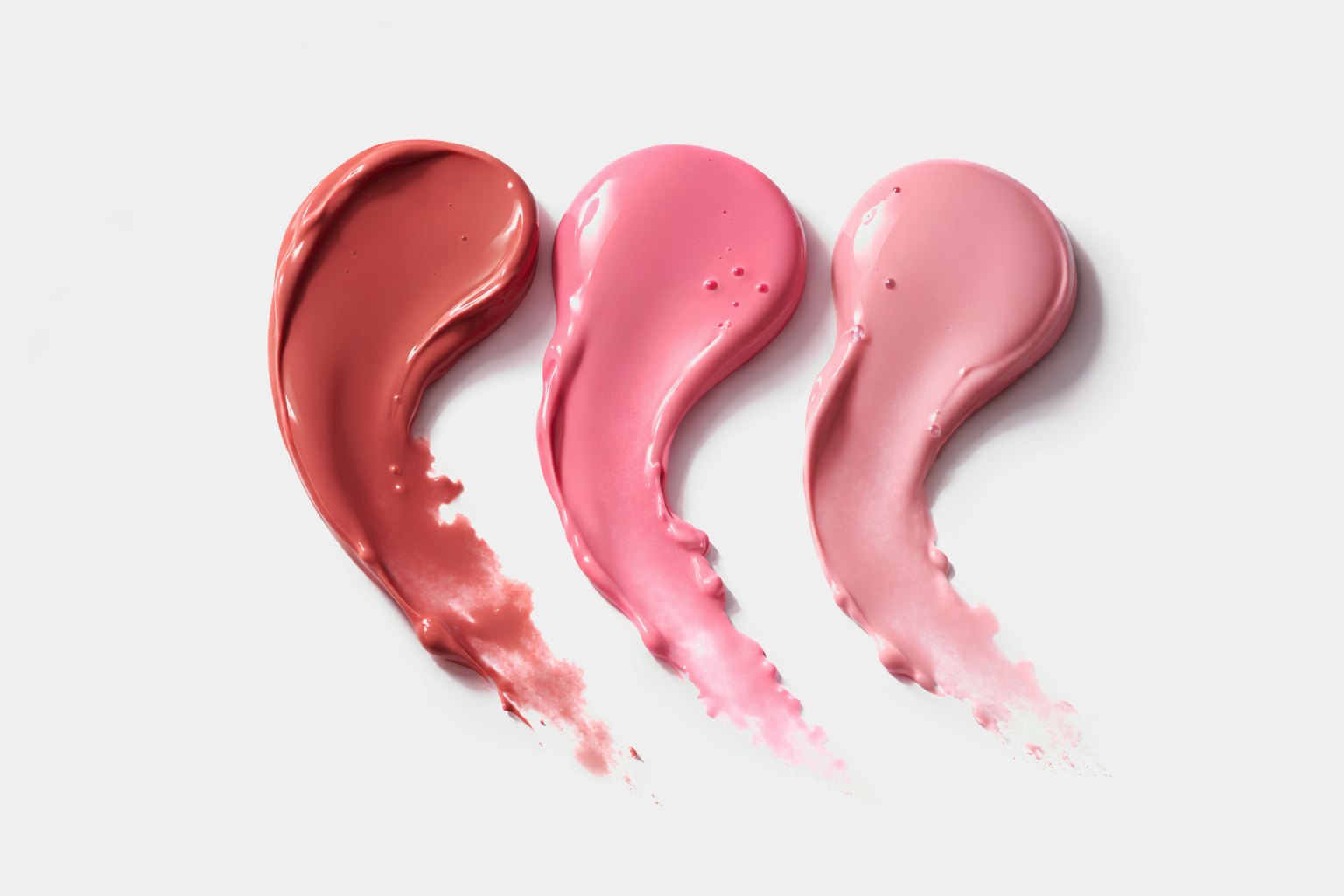
Swatch frames put the formula next to the pack — a smear of cream beside the tube it came out of, three lip shades laid down side by side.
For a category that usually sells on adjectives, a legible swatch does more persuading than a claim, and it survives being cropped into a feed.
Credits
- Brand & Packaging
- OLAF Studio
- Art Direction
- OLAF Studio
- Photography
- OLAF Studio
- Client
- Zentaii
Next project
PeopleOS AI
DIGITAL / DESIGN2026